Key Takeaways:
- 91.3% of screen reader users access content on mobile devices - your "pixel-perfect" RSVP button likely fails them
- Over 4,000 ADA accessibility lawsuits were filed in 2024, with 77% targeting e-commerce websites
- WCAG 2.2 requires focus indicators at least 2 CSS pixels thick with 3:1 contrast ratio
- Beautiful and accessible aren't opposites - they're both non-negotiable
- Pre-built solutions with compliance baked in eliminate the false choice between brand aesthetics and WCAG standards
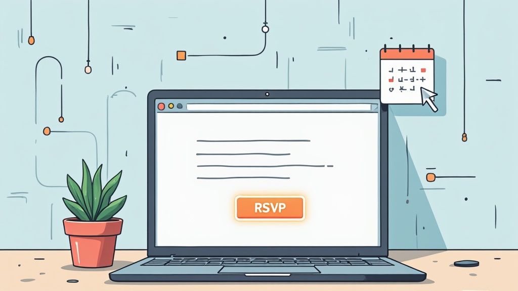
The Beautiful Button That Fooled Everyone
Your RSVP button looks incredible in Figma. The gradient is subtle. The hover state is buttery smooth. Your design lead signed off. The client loves it.
Then QA runs a keyboard-only test.
Suddenly, that beautiful button becomes invisible. No focus ring. No indication of where the user actually is on the page. Just... nothing.
Here's the uncomfortable truth: "It works for me" isn't a design standard. It's a liability waiting to happen.
As Steve Jobs once said, "Design is not just what it looks like and feels like. Design is how it works." And if it doesn't work for everyone, it doesn't work - period.
The Hidden Accessibility Debt in Custom RSVP Links
Every time you ship an RSVP link without proper accessibility considerations, you're accumulating debt. Not the financial kind (yet). The kind that compounds silently until someone files a complaint.
🚫 Focus States: The Invisible Problem
When you create an RSVP link without focus states, here's what happens:
- Keyboard users tab through your page and lose the button entirely
- The focus jumps from one element to another with zero visual feedback
- Users with motor disabilities can't confirm they've selected the right action
According to the W3C's WCAG 2.2 guidelines, focus indicators must be at least 2 CSS pixels thick and maintain a 3:1 contrast ratio between focused and unfocused states. That default browser outline you removed because it "looked ugly"? It was doing more work than you realized.
🎨 The Contrast Ratio Gamble
Most designers lose this gamble without even knowing they're playing.
Your brand's signature coral (#FF6B6B) against that cream background (#FFF5E6) looks gorgeous in the mockup. But the contrast ratio? 2.8:1. You need 4.5:1 for normal text and 3:1 for large text.
You just failed WCAG Level AA.
🔇 Screen Readers and Mystery Buttons
Here's what a screen reader announces when it hits your custom RSVP link:
"Link."
That's it. No context. No purpose. Just... link.
Without proper ARIA labels or semantic HTML, you've created an interactive mystery box. And WebAIM's Screen Reader Survey found that 91.3% of respondents use screen readers on mobile devices. That's not a niche audience - that's the majority of assistive technology users.
📊 Real Numbers on Exclusion
| User Group | What Breaks | Impact |
|---|---|---|
| Keyboard-only users | Missing focus states | Cannot navigate to or confirm button selection |
| Low vision users | Poor color contrast | Cannot read button text or distinguish from background |
| Screen reader users | Missing labels | Cannot understand button purpose |
| Motor impairment users | Small touch targets | Cannot accurately tap on mobile |
| Cognitive disability users | Inconsistent interaction patterns | Cannot predict how elements behave |
You're not excluding a tiny percentage. You're potentially excluding 15-20% of your audience. That's real RSVPs you're never going to get.
The False Choice Between Brand and Compliance
Let's address the elephant in the design system: most designers think WCAG compliance means surrendering their aesthetic vision.
"We can't use our brand colors." "Accessible buttons look like they're from 2005." "The focus rings clash with everything."
But here's the deal: this is a myth. A comfortable one, maybe, because it gives permission to skip the hard work. But still a myth.
Why Accessible ≠ Ugly
Accessibility constraints are design constraints. And designers work within constraints all the time:
- Grid systems
- Brand guidelines
- Responsive breakpoints
- Performance budgets
WCAG is just another constraint. And constraints breed creativity.
The focus state your designer forgot doesn't have to be that ugly blue outline. You can create custom focus rings using your brand colors - as long as they meet the 3:1 contrast requirement. CSS outline-offset lets you create beautiful, on-brand focus indicators that don't look like an afterthought.
Where Design Systems Fail
Most design systems handle accessibility... partially.
They'll specify:
- ✅ Button colors
- ✅ Border radius
- ✅ Typography
But they often miss:
- ❌ Focus state specifications
- ❌ Touch target minimums
- ❌ Screen reader announcements
- ❌ Keyboard interaction patterns
The result? Designers follow the system perfectly and still ship inaccessible components.
Building RSVP Links That Pass Every Audit
Enough with the problems. Let's talk solutions.
🎯 Focus Indicators That Match Your Brand
You don't need to accept the default browser focus ring. But you do need to replace it with something better:
.rsvp-button:focus-visible {
  outline: 2px solid var(--brand-primary);
  outline-offset: 3px;
  box-shadow: 0 0 0 4px rgba(var(--brand-primary-rgb), 0.25);
}
This creates a visible, branded focus state that actually enhances your design instead of fighting it.
🌈 Color Contrast Without Beige
Forget the myth that accessible means boring. Here's how to keep your palette vibrant:
- Darken instead of desaturate - A deeper version of your brand color often hits contrast targets while preserving character
- Add backgrounds strategically - A subtle dark overlay can make light text accessible
- Test in context - Contrast looks different on screens than in Figma
🏷️ Semantic HTML That Screen Readers Understand
This is simpler than most developers think:
- Use
<button>for actions (not<div onclick>) - Add descriptive
aria-labelattributes: "RSVP to Summer Conference 2025" - Include visually hidden text for context when needed
The accessibility checklist your calendar button is failing covers these requirements in detail.
👆 Touch Targets for Real Humans
The minimum touch target size is 44x44 CSS pixels. Not 32px. Not 40px. 44 pixels minimum.
Why? Because human fingers aren't precision instruments. And users with motor impairments need even more space to tap accurately.
🖥️ Testing Beyond Your MacBook
If your testing strategy is "looks good on my MacBook," you're missing:
- Windows High Contrast Mode
- iOS VoiceOver
- Android TalkBack
- Keyboard-only navigation
- 200% zoom
- Reduced motion preferences
Real testing means real devices. Real assistive technologies. Real users when possible.
The Maintenance Nightmare Nobody Warns You About
"But I can build an accessible RSVP button myself!"
Sure. You can. Once.
Then what?
When Things Break
- Chrome updates and changes how
focus-visibleworks - Safari on iOS handles touch events differently than expected
- Your design system evolves and someone forgets to update the RSVP component
- A new team member doesn't know about the accessibility requirements
According to recent research on accessibility lawsuits, over 4,000 ADA web accessibility lawsuits were filed in 2024. And 25% of those cases explicitly cited accessibility widgets and overlays as barriers - meaning quick fixes make things worse, not better.
Frontend developers secretly dread RSVP button tickets. It's not because they're lazy. It's because they know the scope creep that follows:
- Build the button ✅
- Make it work in email clients ⚠️
- Add accessibility features 😬
- Test across browsers 😓
- Maintain it indefinitely 💀
As the saying goes, "The bitterness of poor quality remains long after the sweetness of low price is forgotten." Hand-coded solutions feel cheap until the maintenance bills come due.
The Shortcut That Doesn't Compromise
Here's where Add to Calendar PRO enters the picture - not as a magic wand, but as a pragmatic solution to a real problem.
The platform bakes WCAG compliance directly into every button while respecting your design tokens. You get:
- Focus states that meet 2.4.13 requirements - automatically
- Proper ARIA labels - without writing custom attributes
- Touch targets sized correctly - no guessing
- Keyboard navigation - built in, not bolted on
- Screen reader compatibility - tested across VoiceOver, NVDA, and JAWS
The customization options let you match your design system precisely. Colors, typography, border radius, spacing - all adjustable. But the accessibility layer underneath? That stays rock solid regardless of your visual choices.
For teams who want the full picture on sharing calendar events without sacrificing accessibility or design, this approach eliminates the false choice entirely.
One less audit finding to explain. One less lawsuit to worry about. One less maintenance headache for your frontend team.
Beautiful and Accessible: The Only Standard Worth Having
Your RSVP link should work for everyone who wants to commit.
Not just users with perfect vision and a mouse. Not just people testing on the same MacBook Pro as your design team. Everyone.
Beautiful and accessible aren't opposites. They're both table stakes for professional design work in 2025.
The question isn't whether you can build an accessible RSVP button yourself. The question is whether that's the best use of your time - and whether you can maintain it reliably as standards evolve, browsers update, and team members change.
Sometimes the smartest design decision is choosing the tool that handles the hard parts automatically, so you can focus on what you do best: making things beautiful.
Your screen reader users are waiting. Your keyboard navigators are waiting. Your low-vision audience is waiting.
Don't make them wait any longer for an RSVP button they can actually find. 🎯